Your Podcast Visuals Are Either Winning Listeners or Losing Them
Podcast listeners discover shows through thumbnails before they ever hear a single word. If your cover art looks like it was slapped together in twenty minutes, a significant chunk of your potential audience will scroll right past you without a second thought.
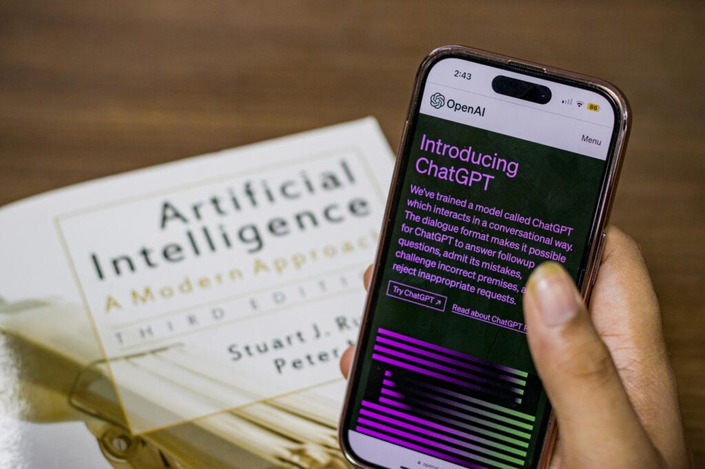
This is exactly why AI image generation has become such a powerful tool for podcasters and audio brands. You don’t need a design degree, a $200 per hour freelancer, or even a subscription to Adobe’s entire creative suite. With the right prompting strategy and a clear sense of your brand identity, you can produce professional-grade podcast cover art, episode artwork, social media graphics, and promotional visuals that compete with shows backed by real production budgets.
The catch? Most podcasters using AI for their visuals are doing it wrong. They’re typing vague prompts, accepting the first output, and wondering why everything looks generic. This guide will show you how to do it properly.
Understanding What Podcast Visuals Actually Need to Do
Before you open Midjourney, DALL-E 3, or Stable Diffusion, you need to understand the functional requirements of podcast artwork. This isn’t regular illustration work. Podcast cover art lives at small sizes, often 3000×3000 pixels in the file but displayed as a tiny square thumbnail on Spotify, Apple Podcasts, or a phone screen. That means complexity kills legibility.
Effective podcast cover art typically has three qualities. First, it reads clearly at 150×150 pixels. Second, it communicates the show’s tone in under two seconds. Third, it looks different from everything else in its category. When you’re creating AI podcast images, you need to engineer your prompts with all three of these constraints in mind, not just aesthetics.
Your broader audio brand ai visuals strategy should also extend beyond just the cover. Episode-specific thumbnails for YouTube uploads, promotional graphics for Instagram, audiogram backgrounds, and guest announcement cards all need to feel like they come from the same visual universe. Consistency is what turns a logo into a brand.
Choosing the Right AI Tool for the Job
Not every AI image generator is equally suited for podcast art. Here’s an honest breakdown of the main options as of 2024:
- Midjourney: Produces the most aesthetically polished outputs, especially for illustration-heavy or atmospheric styles. The learning curve is steeper, and it requires Discord, but for creating a signature visual identity, it’s hard to beat. Best for shows that want a distinctive, almost editorial look.
- DALL-E 3 (via ChatGPT): The most accessible option and genuinely impressive at following complex, nuanced prompts. It handles text rendering better than most competitors, which matters if you want your show title integrated into the artwork itself. Best for beginners or podcasters who want fast, prompt-responsive results.
- Adobe Firefly: Worth considering if you’re already working in Adobe Express or Photoshop, because the integration is seamless. Commercially safe by design since it’s trained on licensed content. Best for professional contexts where IP clarity matters.
- Stable Diffusion (local or via Leonardo.ai): The most customizable option, especially with LoRA models trained on specific styles. Highest ceiling, highest complexity. Best for technically confident users who want granular control.
For most podcasters, starting with DALL-E 3 or Midjourney is the right call. You’ll get usable results quickly, and you can always migrate to more complex tools once you’ve locked in your visual direction.
Building a Prompt Strategy That Actually Works
The single biggest mistake people make when generating podcast cover ai artwork is treating it like a Google image search. Typing “podcast microphone with headphones blue background” will give you something painfully generic. Great AI prompting requires specificity, intentionality, and a little art direction vocabulary.
Here’s a framework that works consistently:
Define the Visual Concept First
Before you type anything into a generator, write a one-sentence description of how your show should feel visually. Not what it’s about, how it should feel. A true crime podcast might want “unsettling, noir, high contrast shadows.” A personal finance show might want “clean, modern, aspirational but approachable.” A comedy interview show might want “bold, vibrant, slightly irreverent illustration.” This feeling-first approach prevents generic outputs.
Anatomy of a Strong Prompt
Your prompt should typically include: the subject or concept, the art style or medium, the color palette, the mood or atmosphere, and any compositional notes. For example, instead of “microphone logo for podcast,” try something like: “Minimalist vector illustration of a vintage condenser microphone, warm amber and deep navy color palette, slightly retro feel, clean composition with negative space, suitable for circular crop.”
Notice how that prompt gives the AI art direction, not just a subject. You’re specifying medium (vector illustration), palette (amber and navy), mood (retro), and even practical constraints (circular crop, since most podcast thumbnails are square but displayed within rounded interfaces).
Iterating Toward Consistency
One image isn’t a brand. You need a system. In Midjourney, use the “vary (subtle)” feature to explore slight variations of a winning output without completely changing the aesthetic. In DALL-E 3, paste your original prompt back in with minor tweaks and reference what worked. Once you have two or three images you love, reverse-engineer what the prompts had in common and codify that as your “visual style guide.” Every piece of ai podcast artwork you generate from that point forward should reference those consistent elements.
Creating a Cover That Converts on Platform
Podcast cover art has specific technical requirements you can’t ignore. Apple Podcasts and Spotify both require a minimum of 1400×1400 pixels and a maximum of 3000×3000 pixels in JPEG or PNG format. Most AI generators will output at resolutions you’ll need to upscale or adjust before submission.
Tools like Topaz Gigapixel AI or the upscaling features built into Magnific can take a 1024×1024 AI output and cleanly scale it to 3000×3000 without the muddy artifacts you’d get from a simple Photoshop resize. This extra step matters more than most people realize. Blurry or soft artwork signals low production values even if the concept is strong.
When designing your podcast cover ai artwork, test it at actual display sizes before finalizing. Drop it into a mock podcast platform screenshot, shrink it to 150 pixels wide, and ask yourself honestly whether the title is readable and the image is recognizable. If you can’t tell what it is at thumbnail size, your listeners can’t either.
One proven structural approach for covers that work at small sizes: one dominant visual element (character, object, or abstract shape), bold typography that takes up roughly 40% of the frame, and a background with strong contrast relative to the foreground. Complexity is the enemy of legibility when you’re 150 pixels wide on a phone screen.
Extending Your Visual Brand Across Episodes and Social Media
A great cover is just the foundation. Where podcasters with strong audio brand ai visuals really pull ahead is in the consistency of every touchpoint. Episode thumbnails for YouTube and Spotify video, guest announcement graphics, audiogram templates, newsletter headers, and merch designs should all pull from the same visual DNA.
Here’s a practical workflow for creating a scalable template system:
- Generate three to five “base” images in your defined visual style using AI, at high resolution.
- Import them into Canva or Adobe Express as background assets for editable templates.
- Build a simple template for each content type: episode art, guest cards, quote graphics.
- Use consistent fonts, the same two or three brand colors, and always the same logo placement.
- When you need new episode-specific imagery, generate fresh ai podcast graphics in the same style and slot them into your existing templates.
This approach means you’re not starting from scratch every week. You’re building a system that produces brand-consistent content in fifteen minutes per episode rather than three hours.
Handling the Text Problem in AI-Generated Podcast Art
If there’s one consistent frustration with AI image generation for podcast branding, it’s text rendering. Most AI generators still struggle with typography, producing garbled letters or oddly spaced words when you ask them to include show titles in the image itself.
The smarter workflow: generate your artwork without any text, then add your podcast name and episode title in Canva, Photoshop, or Figma afterward. This gives you full typographic control, which honestly produces better results anyway. You can choose fonts that match your brand, adjust kerning, add drop shadows for legibility, and maintain consistent styling across every piece of content you produce.
DALL-E 3 is currently the best AI generator at rendering legible text, and for short phrases it’s often workable. But even then, always double-check every letter. Typos baked into artwork are a nightmare to fix after the fact and look deeply unprofessional when they slip through.
A Few Common Mistakes Worth Skipping Entirely
Roughly 70% of podcasters who try AI image generation end up abandoning it after a few frustrating sessions, not because the tools don’t work, but because they hit predictable obstacles without knowing how to navigate them.
Don’t try to generate a face that looks like a specific real person. It’s legally murky, technically difficult, and usually looks uncanny. If your show features a human host prominently on the cover, either use a real photo or ask the AI for an illustrated character in your brand’s art style rather than a photorealistic portrait.
Don’t skip the upscaling step. Low-resolution artwork undermines everything else you’ve done well. Don’t use the first output you get without iterating. The first result is rarely the best one. And don’t generate assets piecemeal with no connecting visual thread. Brand consistency isn’t a nice-to-have; it’s what makes a collection of images feel like a real brand rather than a random pile of graphics.
Start With the Cover, Then Build Outward
If you’re new to this whole process, don’t try to build out a complete visual system in one sitting. Start with your podcast cover art, get it right, and use that as your visual foundation. Once you’ve locked in a style that represents your show’s identity, everything else, from episode thumbnails to social graphics, becomes much easier to produce consistently.
Pick one AI tool, commit to learning it properly for two weeks, and focus your energy on developing a prompt style that reliably produces on-brand results. The podcasters who are winning visually right now aren’t necessarily working with the most powerful tools. They’re working with a clear creative vision and the discipline to apply it consistently. AI just makes that vision faster and cheaper to execute than it’s ever been before.