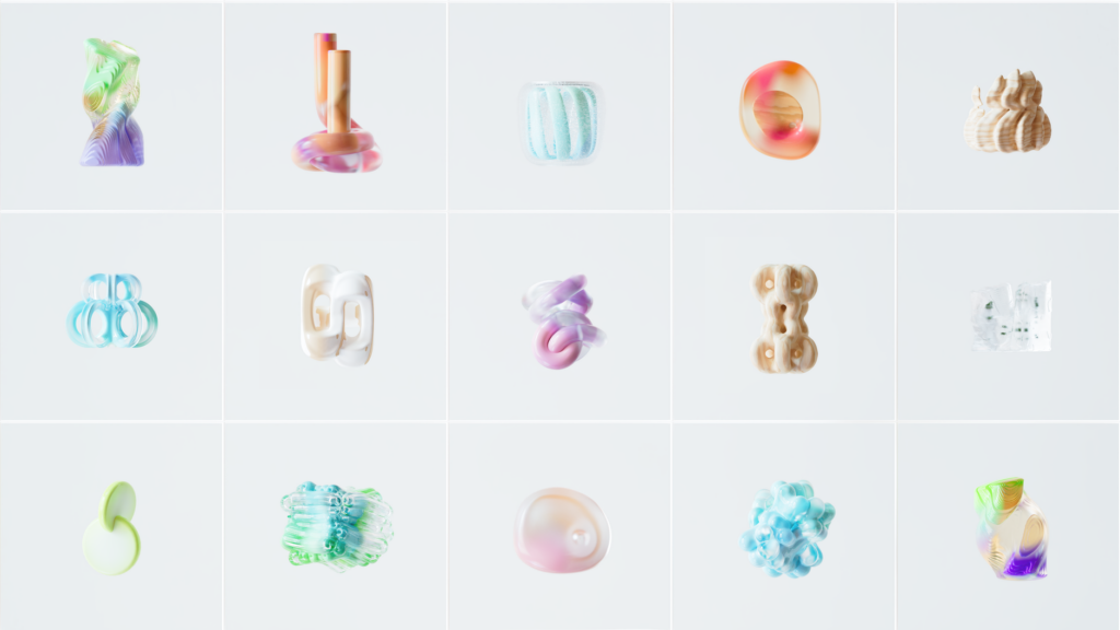
Getting beautiful images from an AI generator is easy. Getting twenty beautiful images that actually look like they belong together? That’s where most people hit a wall.
If you’ve spent any time with tools like Midjourney, DALL-E 3, or Stable Diffusion, you’ve probably experienced the chaos firsthand. You generate a stunning hero image for your brand, then try to create a matching social post graphic, and suddenly you’ve got two completely unrelated aesthetics staring back at you. The colors are off, the mood is different, the lighting feels like it came from a different solar system. Consistent AI images don’t happen by accident. They happen by design, and specifically by following a system.
This article breaks down exactly how to build that system, whether you’re creating ai brand visuals for a business, illustrating a long-form blog, or building a cohesive portfolio of visual ai art.
Why AI Images Fall Apart Visually (And Why It’s Not Your Fault)
AI image generators are, at their core, probability machines. Every time you submit a prompt, the model is sampling from an enormous distribution of possible outputs. Even with identical prompts, you’ll rarely get the exact same image twice. That’s a feature for creative exploration, but it’s a bug when you need consistency.
The problem compounds when you’re working across different prompts. You might nail the lighting in one generation, the color palette in another, and the compositional style in a third, but they never quite converge. The result is a visual library that looks like it was assembled from five different photographers shooting five different projects.
Understanding this underlying randomness is actually freeing. It means the problem isn’t that you’re bad at prompting. It means you need a structured approach that constrains the AI’s output toward a defined aesthetic range. Think of it less like giving instructions and more like setting boundaries inside which the AI can roam.
Building Your Style Reference Sheet Before You Generate Anything
The single most effective thing you can do before generating a single image is build a style reference sheet. This is a document, even a simple text file, that captures every element of your intended visual style in concrete, specific language.
Here’s what to include:
- Color palette: Don’t just say “warm tones.” Specify “muted terracotta, dusty sage, and warm cream with low saturation.” The more precise, the better.
- Lighting style: “Soft diffused natural light from the left side” is far more useful than “nice lighting.”
- Mood and atmosphere: Words like “serene,” “melancholic,” “high-energy,” or “clinical” give the model emotional direction.
- Camera or rendering style: Think “35mm film grain,” “shallow depth of field,” “bird’s eye view,” or “flat vector illustration.”
- Artistic references: Citing photographers, illustrators, or art movements (like “Bauhaus minimalism” or “Studio Ghibli backgrounds”) anchors the output to a recognizable aesthetic.
- Negative elements: List what you explicitly don’t want. “No lens flare, no oversaturated colors, no busy backgrounds.”
Once you have this sheet, treat it like a living document. Every time a generation works particularly well, extract the specific prompt language that made it work and add it to your reference sheet. You’re essentially building a vocabulary for your personal ai image style.
The Prompt Skeleton Method for Coherent AI Images
Random prompt writing produces random results. The fix is to stop writing prompts from scratch every time and start using a prompt skeleton: a reusable template that locks in your core style variables while leaving room for the subject to change.
A basic skeleton looks something like this:
[Subject description], [setting/environment], [lighting style], [color palette], [camera style], [mood], [artistic reference], [technical specs like aspect ratio or quality modifiers]
In practice, a filled-in skeleton might read: “A woman reading a book, sitting in a sunlit cafe interior, soft window light from the right, muted sage and warm beige tones, shot on 35mm film with slight grain, contemplative and quiet mood, in the style of Gregory Crewdson’s naturalistic compositions, 4:5 aspect ratio, highly detailed.”
Now, to generate your next coherent image in the same series, you only change the subject. The woman reading becomes a man writing. The cafe becomes a library. Everything else stays identical. That’s how you start producing consistent AI images that feel like part of a collection rather than a random gallery.
Keeping a master prompt file, organized by project, means you’re never starting from zero. Over time, this file becomes genuinely valuable. Some creators treat these prompt libraries as proprietary assets, and it’s not hard to see why.
Using Seed Numbers and Model Settings as Style Anchors
Most AI image platforms expose a setting called a seed number, and it’s one of the most underused tools for creating visual consistency. The seed determines the initial randomness of the generation process. If you use the same seed with the same prompt, you’ll get a nearly identical image. If you use the same seed with a slightly modified prompt, you’ll get a variation that shares structural and stylistic DNA with your original.
In Midjourney, for example, you can retrieve the seed of any image you love and then use the “sref” (style reference) parameter or simply reuse the seed alongside your template prompt to keep future generations in the same stylistic neighborhood. Stable Diffusion users have even more granular control, being able to lock seeds, save model checkpoints tuned to specific aesthetics, and apply LoRA models trained on particular visual styles.
Beyond seeds, pay attention to which model version you’re using. Midjourney v5, v6, and Niji all have distinctly different aesthetic tendencies. DALL-E 3 renders things differently from Firefly. Mixing model versions across a project is one of the fastest ways to destroy visual cohesion. Pick one model version and stay with it for the duration of a project.
Style References and Image-to-Image Features Are Your Secret Weapons
If text prompts alone feel like steering a ship with a broken rudder, image-based references are your GPS. Most modern AI image tools offer some form of image reference functionality, and learning to use it is genuinely transformative for building visual ai art that holds together.
In Midjourney, the “sref” (style reference) parameter lets you upload an image and instruct the model to apply its visual style to a new generation. This isn’t about copying content; it’s about borrowing the tonal range, texture, color relationships, and compositional sensibility of a reference image. You can even chain multiple references together and assign weights to each one.
Stable Diffusion’s img2img pipeline takes a different approach. You feed it an existing image and a prompt, and it generates something new that blends both inputs. The “denoising strength” slider controls how much the output deviates from the source image. Lower values (around 0.3 to 0.5) keep the output visually close to your reference, which is ideal when you’re trying to extend a consistent look across multiple assets.
Adobe Firefly offers “structure reference” and “style reference” as separate controls, which gives you even finer precision. You can maintain the compositional structure of one image while applying the color and texture style of another. For ai brand visuals especially, this kind of control is invaluable when you need brand consistency but varied subjects.
Creating a Style Test Sheet to Validate Consistency
Here’s a practical habit that professional visual artists and photographers have used forever, now adapted for AI: the style test sheet.
Before committing to generating your full asset library, generate a small “test batch” of five to eight images using your template prompt, with varied subjects but identical style parameters. Then lay them all out side by side, either in a design tool like Figma or just as browser tabs. Ask yourself honestly: do these feel like they came from the same creative mind? Do the shadows fall at the same angle? Do the colors feel harmonious rather than coincidental? Is the level of detail consistent?
If something feels off, diagnose which parameter is causing the drift. Often it’s something small, an ambiguous color description or a missing lighting note, that’s letting the model wander. Tighten that parameter in your skeleton prompt and run the test again.
This process typically takes thirty minutes to an hour before a major project, but it saves enormous amounts of time and frustration later. You’re essentially building quality control into the front end of your workflow rather than discovering problems after generating two hundred images.
Organizing Your Outputs So Your Style Actually Scales
Consistency isn’t just about the generation process. It’s about what you do with the outputs afterward. A disorganized library of AI images quickly becomes unusable, especially when you’re working on multiple projects or creating ai brand visuals that need to stay recognizable over months.
Develop a simple naming and folder convention. Something like “ProjectName_StyleVersion_Subject_Date” takes five seconds to type and saves hours of hunting later. Store your best generations alongside their exact prompts, seeds, and model versions. Treat each strong image like a case study: what specifically worked, and why?
Over time, you’ll build a personal reference library that’s infinitely more useful than any generic prompt guide. It’s calibrated to your specific aesthetic goals, your preferred tools, and the visual language your audience already responds to.
Consistency in visual style isn’t a luxury reserved for design agencies with big budgets. It’s a skill built through system-thinking, specific language, and deliberate practice. Start with a style sheet, build a prompt skeleton, use seed numbers and image references to anchor your outputs, and test before you scale. Do that consistently, and your AI image library will start looking less like a random experiment and more like a genuine creative body of work.