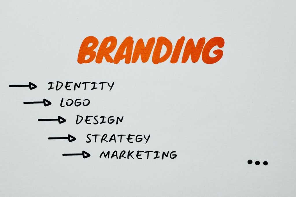
Your Brand Visuals Are Either Working For You or Against You
Most brands blend into the background, and the painful truth is they don’t even know it. If your visuals look like everyone else’s, you’re not just forgettable , you’re actively losing customers to whoever figured out how to stand out first. AI art gives you a real chance to change that, and you don’t need a design degree or a $10,000 agency retainer to do it.
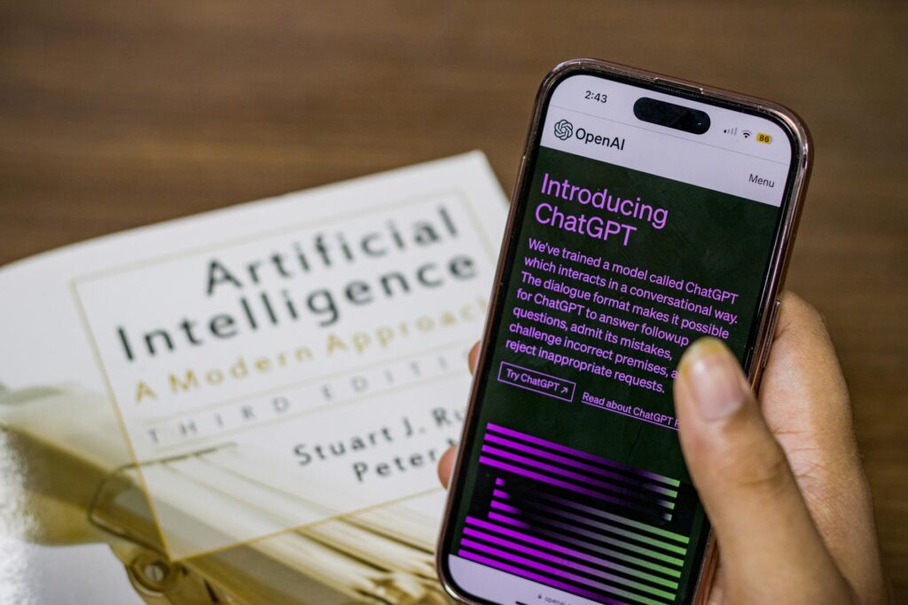
Building an ai brand identity from scratch sounds intimidating until you understand what the tools actually do. Platforms like Midjourney, Adobe Firefly, Stable Diffusion, and DALL-E 3 let you generate highly specific, stylistically consistent visuals by describing what you want in plain language. The key word there is “consistent.” That consistency is exactly what transforms a handful of pretty images into a recognizable brand.
This guide walks you through the entire process, from choosing your visual style to generating production-ready assets. Whether you’re a solopreneur, a small business owner, or a creator building a personal brand, the approach is the same.
Why AI-Generated Art Is Genuinely Different From Stock Photos
Stock photos have a problem that everyone recognizes but nobody talks about directly: they look like stock photos. There’s a sameness to them, a kind of artificial perfection that audiences have learned to distrust. You’ve seen the same smiling businesspeople, the same flat-lay coffee cups, the same generic handshakes. Your audience has too.
When you create brand visuals with AI, you’re generating something that didn’t exist before. Nobody else has that exact image with that exact lighting, color palette, and composition , unless they use the same prompt you did. That uniqueness is enormously valuable for brand differentiation.
There’s also a flexibility advantage worth taking seriously. Need your brand mascot in a winter scene? A futuristic cityscape? A hand-painted watercolor version for your holiday campaign? You can generate all of those variations while keeping the underlying style and character consistent. A traditional design workflow would charge you separately for every single one of those.
The cost math is hard to ignore too. A professional brand identity package from a design studio often runs between $3,000 and $15,000. A monthly subscription to a premium AI image generator costs between $10 and $60. You’re not getting identical results, but for many small brands, AI-generated assets are genuinely good enough , and in some cases, they’re better because they can be iterated faster.
Building Your Visual Style From the Ground Up
Before you open any AI tool, spend some time getting clear on what your brand actually stands for. This isn’t a fluffy exercise. The specifics you nail down here become the building blocks of every prompt you write.
Ask yourself three questions. What’s the emotional tone of your brand? (Calm and trustworthy? Bold and energetic? Playful and quirky?) What’s your target audience’s aesthetic preference? (Minimalist millennials respond differently than maximalist Gen Z shoppers.) And what visual references already exist that you admire, even outside your industry?
Once you have answers, you can start building what I’d call a style brief. Think of it as a short paragraph that describes your visual world. Something like: “Soft, muted earth tones. Organic textures. Illustrated botanical elements. Feels like a Saturday morning at a farmers market.” That brief becomes the spine of every prompt you write, and it’s what keeps your brand design with AI from looking like a random collection of pretty images.
How to Write Prompts That Actually Deliver Consistent Results
Prompting for brand consistency is a skill, and it’s one most people learn by making the same mistakes a few times. Here’s how to shortcut that learning curve.
Structure your prompts in layers. Start with the subject, add the style, then specify the mood, then the technical parameters. An example for a skincare brand might read: “Minimalist flat-lay of botanical skincare products, soft warm lighting, sage green and ivory color palette, editorial photography style, clean background, high resolution.” Every element in that prompt is doing specific work.
Once you find a combination that works, save it. That base prompt becomes your template. When you need a new image, you’re not starting from zero , you’re swapping out the subject while keeping all the style parameters intact. This is how you create a brand with AI images that feels cohesive rather than chaotic.
For Midjourney users specifically, using the same seed number across related images can help maintain stylistic consistency. In Stable Diffusion, saving your model settings and using the same checkpoint across a project produces similar results. Different tools have different levers, but the principle is the same everywhere: document what works and repeat it deliberately.
The Core Brand Assets You Should Generate First
Not all brand assets are equal in terms of priority. When you’re starting out with AI brand art, focus your energy on the visuals that appear most frequently and carry the most brand weight.
Here’s a practical order to work through:
- Hero imagery: The banner images for your website homepage, social profiles, and email headers. These are the first thing people see, so they set the tone for everything else.
- Background textures and patterns: Subtle, repeating visual elements that can be used across slide decks, packaging, and digital materials to create a sense of visual unity.
- Brand mascot or character: Not every brand needs one, but if yours does, AI makes it genuinely feasible to develop and iterate on a character without paying an illustrator hundreds of dollars per revision.
- Social media content templates: Generate a set of base images in your defined style that can serve as backgrounds or framing elements for text-based posts.
- Product or service illustrations: Especially useful for service businesses that don’t have tangible products to photograph.
One thing to keep in mind: AI tools currently struggle with text rendered inside images. If you need a logo or any asset with readable lettering, you’ll want to generate the visual element in AI and add the text in a tool like Canva, Adobe Express, or Figma. That combination actually works beautifully, and it’s a workflow a lot of smart brand builders are already using.
Maintaining Consistency Across Every Touchpoint
The difference between a brand that looks professional and one that looks cobbled together is almost always consistency. And consistency is where a lot of people who try to build a brand with AI images fall down, because they generate images whenever they need them without any systematic approach.
Create a simple brand asset library. It doesn’t need to be complicated , a shared Google Drive folder or a Notion page works fine. Store your best-performing prompts alongside the images they produced. Add notes about which AI tool and which settings you used. Over time, this library becomes genuinely valuable. When you bring on a virtual assistant, a social media manager, or a new team member, you can hand them this document and they can generate new, on-brand visuals without needing to reverse-engineer your style.
Color consistency deserves its own mention. AI tools don’t automatically know your brand colors, so you need to specify them every single time. If your brand uses a particular shade, learn its hex code and describe it precisely in prompts. Instead of saying “blue,” say “deep navy blue, hex #1B2A4A.” The more specific you are, the more consistent your outputs will be.
When to Bring in a Human Designer (and When You Don’t Need To)
AI handles generative visuals well. It doesn’t handle everything. There are specific tasks where a human designer still adds irreplaceable value, and being honest about that line saves you from expensive mistakes.
Logo design is the clearest example. A logo needs to be a vector file that scales perfectly from a business card to a billboard. It needs to work in black and white. It needs to be trademarked if you’re serious about protecting your brand. AI-generated logos are getting better, but they’re not reliably production-ready without significant cleanup in vector software. For your primary logo, investing in a designer is usually worth it.
Beyond that, most brand visuals with AI are genuinely production-ready without human intervention. Marketing graphics, social content, website imagery, presentation decks, email headers , all of these are fair game for an AI-first workflow.
Legal and Ethical Considerations You Can’t Ignore
The legal landscape around AI-generated art is still evolving, and pretending otherwise would be doing you a disservice. A few things you should know right now:
Commercial licensing varies by platform. Midjourney’s paid tiers allow commercial use of your generated images. Adobe Firefly was specifically built with commercially safe training data, which makes it a smart choice for brands worried about intellectual property exposure. Stable Diffusion through third-party platforms requires you to check the specific terms of whatever service you’re using. Read the fine print before you put an AI-generated image on a product you’re selling.
Style mimicry is another gray area. Prompting an AI to generate “in the style of” a specific living artist is ethically murky and increasingly legally contested. You’re on much safer ground developing your own visual language rather than borrowing another creator’s.
Copyright on AI-generated images is another open question in most jurisdictions. In the United States, the Copyright Office has ruled that purely AI-generated images without human creative input aren’t automatically eligible for copyright protection. That means anyone could technically use an image you generated. For brand assets with commercial value, adding meaningful human creative input , through editing, compositing, or significant post-processing , strengthens your claim to the work.
Turning Your AI Visual System Into a Real Competitive Advantage
Here’s what most people miss when they start exploring brand design with AI: the speed isn’t just a convenience, it’s a strategic asset. You can now test visual directions in an afternoon that used to take weeks of back-and-forth with a design team. You can A/B test hero images on your website in real time. You can refresh your seasonal visuals every few weeks instead of twice a year.
That agility compounds over time. Brands that iterate their visuals faster learn faster. They find out what resonates with their audience sooner. They show up looking current and alive instead of stale and static. In a market where attention is the scarcest resource, that’s not a minor advantage.
Start simple. Pick one AI platform, write a style brief for your brand, and generate ten to fifteen images this week using a consistent base prompt. Don’t try to build the whole system at once. Build a small library that works, refine your prompting style, and expand from there. The brands that are already winning with AI-generated visuals didn’t start with a master plan , they started with a prompt and iterated their way to something great.