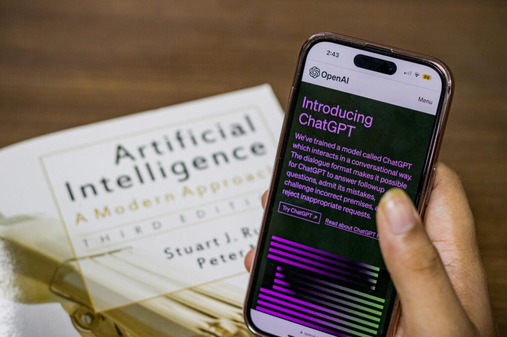
Print Calendars Still Matter, and AI Is Changing How We Make Them
Print calendars haven’t gone anywhere. In fact, the personalized calendar market generates hundreds of millions of dollars annually, and whether you’re creating merchandise to sell on Printify, gifting a custom wall calendar, or producing branded company calendars, the biggest bottleneck has always been sourcing quality images. AI changes that equation completely.
Using AI to generate calendar visuals isn’t just a workaround for people without design budgets. It’s genuinely a better workflow for many creators. You get full control over style, subject matter, mood, and color palette without dealing with licensing headaches, stock photo subscription fees, or the creative limitations of what photographers happened to shoot. If you want twelve consistently styled botanical illustrations for a 2026 wall calendar, you can have them by the end of the afternoon.
This guide walks you through the full process: choosing the right AI tools, prompting effectively for print-quality output, maintaining visual consistency across all twelve images, and preparing your ai calendar images for actual production. There’s real craft involved, and it’s worth learning properly.
Choosing the Right AI Tool for Print-Quality Calendar Art
Not every AI image generator is built with print in mind. Web display images typically live at 72 DPI. Print calendars need at least 300 DPI, and often higher for large-format wall prints. This single requirement eliminates a lot of otherwise solid tools from the conversation.
Here are the tools that actually hold up for print calendar ai work:
- Midjourney: Produces some of the most aesthetically polished images available from any AI tool. Output resolution is limited by default, but you can use the “upscale” and “high variation” modes, and then run images through an external upscaler to reach print-ready resolution. Its stylistic consistency across multiple generations is excellent when you use the same prompt structure.
- Adobe Firefly: Built explicitly for commercial use with print production in mind. Firefly generates images that are commercially safe (trained on licensed content), and it integrates directly with Photoshop, which is exactly where you’ll be doing your final print prep. A genuinely strong choice for calendar art ai projects with commercial intent.
- DALL-E 3 via ChatGPT: Very capable at following nuanced prompts and good for illustrations and stylized work. Resolution is moderate, so upscaling is necessary. Its ability to understand complex scene descriptions is one of its strongest features.
- Stable Diffusion (via ComfyUI or Automatic1111): The most flexible option if you’re willing to invest time in the learning curve. You can generate natively at higher resolutions, use ControlNet for precise composition control, and fine-tune models to a specific style. Overkill for beginners, but powerful for anyone serious about create calendar visuals ai workflows at scale.
- Ideogram: Particularly strong for images that include text elements, which is useful if you want AI-generated artwork that incorporates month names or short seasonal phrases directly into the illustration.
For most people starting out, Midjourney or Adobe Firefly is the right call. Firefly wins on commercial safety; Midjourney wins on raw aesthetic quality.
How to Write Prompts That Produce Consistent Calendar Images
This is where most people struggle. Generating one beautiful image is easy. Generating twelve images that look like they belong together in the same calendar is an actual skill.
The core principle is this: lock your style variables first, then vary only the content. Every prompt for your twelve months should share the same artistic style descriptor, the same color treatment instructions, the same lighting conditions, and the same aspect ratio specification. The only thing that changes is the subject.
Here’s a practical example. Say you’re building a nature-themed print calendar with a painterly watercolor aesthetic. Your base prompt template might look like this:
“Watercolor illustration, soft muted tones, loose brushwork, white paper texture visible, natural subject, [MONTH SUBJECT], centered composition, 9×12 vertical orientation, no text, no borders, award-winning botanical illustration style”
For January you substitute “bare birch trees in light snow.” For July you swap in “wild sunflower field under bright haze.” The style stays locked. The season shifts. This is the foundation of consistent ai calendar design.
A few additional prompting tips that matter specifically for calendar images:
- Always specify aspect ratio. Calendar pages are usually 8.5×11 or 11×17, meaning a portrait (vertical) orientation. Specify this explicitly or you’ll get landscape images that crop awkwardly.
- Add “no text” unless you want text in the image. AI tools love adding random text artifacts, especially Midjourney.
- Request “full bleed” or “edge to edge composition” if you want the image to extend to the page borders. This avoids awkward white margins you’d have to fill later.
- Use negative prompts where the tool supports them. Exclude “watermark, signature, border, frame, text” as a baseline for clean print output.
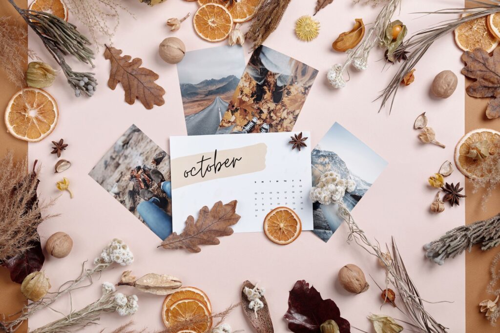
Building a Cohesive Theme Across All Twelve Months
A calendar is a product, not a portfolio. The images need to feel curated, not just collected. This is an aesthetic judgment call that AI alone can’t make for you, but there are structural approaches that force cohesion.
One approach is thematic anchoring. Pick a single visual concept and interpret it twelve ways. “Doors of Europe” gives you twelve architectural images with a clear thread. “Seasons of a single garden” keeps you geographically and stylistically rooted. “Nocturnal wildlife” locks both the subject category and the lighting condition. The more specific your theme, the more naturally unified your calendar art ai output becomes.
Another technique is color palette pinning. Define a limited palette before you generate anything: perhaps warm terracotta, dusty sage, cream, and deep navy. Reference these colors explicitly in every prompt. “Warm terracotta and dusty sage color palette” included in each prompt will pull your outputs toward a common tonal family even when the subjects differ dramatically.
If you’re using Midjourney, the “style reference” feature (–sref) is invaluable here. Once you’ve generated a first image you love, you can feed it back in as a style reference for every subsequent generation. Midjourney will try to match the visual treatment, color, texture, and mood. It’s not perfect, but it dramatically reduces the variance across your twelve images.
Stable Diffusion users can do this even more precisely by fine-tuning a LoRA on a set of reference images. But again, that’s an advanced path that requires more setup time.
Getting Your Images Print-Ready: Resolution, Color, and File Format
Generating a beautiful image is only half the job. Getting it to a printer without disappointment requires some technical preparation that a lot of digital-first creators skip, often with costly results.
Resolution and upscaling. Most AI generators output images at 1024×1024 or 1024×1536 pixels by default. For a standard 8.5×11 calendar page at 300 DPI, you need roughly 2550×3300 pixels. That means upscaling is almost always necessary. The best tools for this are Topaz Gigapixel AI (paid, excellent results), Adobe Photoshop’s “Super Resolution” feature, or free tools like Upscayl. Avoid generic Photoshop enlargement, which will visibly soften detail.
Color mode conversion. AI-generated images are RGB by default. Commercial printers, especially offset printers, work in CMYK. Colors can shift significantly during conversion, especially saturated blues, vibrant greens, and neon tones that simply don’t exist in the CMYK gamut. Convert your images to CMYK in Photoshop before sending to print, and proof them on a calibrated monitor if possible. What you see on screen won’t always be what you get on paper.
File format. Save final print files as TIFF or high-quality PDF. JPEG compression artifacts, which are invisible on screen, can become visible in large print. TIFF preserves all your image data without compression. Most print-on-demand services like Printful, Blurb, and Artifact Uprising will specify their preferred format; follow their spec sheets precisely.
Bleed and safe zones. If you’re using a print template (which you should be), set up your files with a 0.125-inch bleed on all sides. Keep important visual content at least 0.25 inches inside the trim edge. AI images often have strong compositional elements near the edges that get trimmed in production if you haven’t accounted for this.
Turning Your Images Into a Finished Calendar Product
Once you have twelve print-ready ai calendar images, you need layout software to assemble the actual calendar. Adobe InDesign is the industry standard and worth learning if you plan to do this regularly. Canva Pro is significantly more accessible and handles calendar layouts well for most use cases. Affinity Publisher is a strong one-time-purchase alternative to InDesign if you want professional control without subscription costs.
For the calendar grid itself, most creators either use pre-built templates (Canva and Blurb both offer these) or design their own in InDesign. Keep the grid design clean. The imagery is the star. Overly styled fonts and decorative calendar grids compete with your ai calendar design work rather than supporting it.
Print-on-demand platforms like Blurb, Printful, and Artifact Uprising make fulfillment straightforward once your files are ready. Blurb specializes in books and calendars specifically, and their calendar templates are well-matched to standard print specifications. If you’re selling through Etsy or your own store, these platforms handle printing and shipping without you maintaining inventory.
One More Thing Worth Saying
AI-generated calendar art isn’t a shortcut to mediocre products. Used well, it’s a legitimate creative tool that lets independent creators compete with professionally resourced studios. The people producing standout results aren’t just clicking “generate” and uploading whatever comes out. They’re developing real prompt craft, building style systems, and treating image preparation with the same seriousness as any print professional would.
Start with one strong theme, one tool you’ll commit to learning deeply, and one print run of a single calendar. Get that physical object in your hands. You’ll immediately see what works, what needs refining, and what’s genuinely possible with the create calendar visuals ai workflow. That first physical print tells you more than any tutorial can. Go make it.