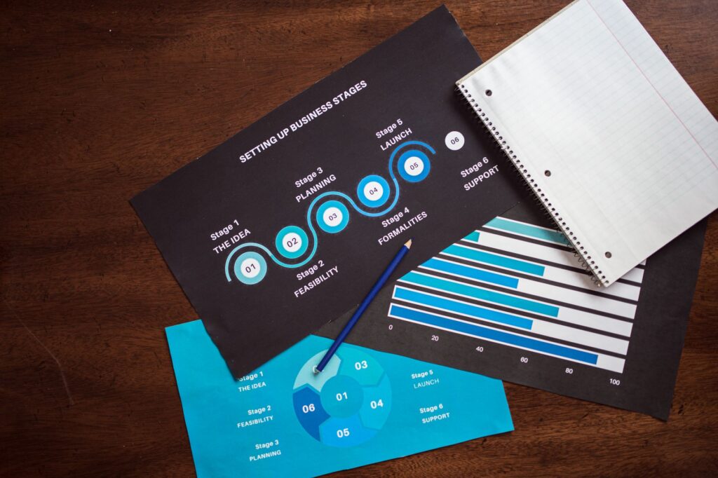
Stop Making Infographics the Hard Way
Most people spend three to five hours building a single infographic from scratch, wrestling with design software they barely know, hunting for icons, and second-guessing every font choice. AI has fundamentally changed that equation, and if you’re not using it yet, you’re burning time you don’t have.
Creating ai infographic visuals used to require either a professional designer or a steep learning curve with tools like Adobe Illustrator or Canva’s more advanced features. Now, a combination of AI image generators, language models, and purpose-built design platforms can get you from raw data to polished visual content in under an hour. This guide breaks down exactly how to do it, what tools actually work, and where most people go wrong.
What “AI Infographic” Actually Means (It’s More Than One Thing)
Before diving into the how-to, it’s worth being precise about what we’re talking about, because “AI infographic” covers a few distinct workflows that serve different purposes.
The first type is fully generative: you prompt an AI image model like Midjourney, DALL-E 3, or Stable Diffusion to produce something that looks like an infographic. These outputs can be visually stunning, but they have a serious limitation. AI image generators don’t understand data. Ask one to create a bar chart showing quarterly revenue, and it’ll produce something that looks like a bar chart but has made-up numbers, incorrect labels, or completely fabricated information. For decorative or conceptual visuals, this works great. For data-driven content, it doesn’t.
The second type uses AI to assist in building real, data-accurate infographics. Tools like Piktochart AI, Visme, Canva’s AI features, and Adobe Express now let you input your actual data and generate layout suggestions, icon selections, color schemes, and design structures automatically. This is where the real productivity gain lives for most content creators and marketers.
The third type is AI data visualization, where tools like Tableau AI, Microsoft Copilot in Power BI, or Julius AI help you turn spreadsheets into charts and graphs automatically, which you can then export and incorporate into a designed infographic.
Knowing which workflow fits your goal is the first decision you need to make.
The Right Tools for Each Stage of the Process
Generating the Raw Concepts and Structure
Start with a language model, specifically ChatGPT, Claude, or Gemini. Before you touch any visual tool, use AI to determine what your infographic should actually say. Give it your topic, your target audience, and your data, and ask it to suggest an information hierarchy. What’s the headline stat? What supporting points belong in the body? What call to action or takeaway should appear at the bottom?
This step takes about ten minutes and it saves you from the most common infographic mistake: trying to say too many things. A focused prompt might look like this: “I’m creating an infographic about remote work productivity for small business owners. I have five key statistics. Help me structure these into a clear narrative with a headline, three supporting sections, and one closing insight.” The AI will give you a content skeleton. That’s your blueprint.
Building the Visual Layout
Once you have your structure, move to a dedicated infographic AI tool. Here are the ones actually worth your time:
- Piktochart AI: Enter your topic or paste your text, and it generates a complete infographic with layout, icons, and color scheme. You can edit everything after generation. Best for quick turnarounds.
- Visme: More design control than Piktochart, with an AI designer feature that builds slides or infographic layouts from a prompt. Strong for branded content.
- Canva Magic Design: Upload your data or type your content, and Canva’s AI suggests layouts from its template library. Less “generative” and more “smart selection,” but fast and reliable.
- Beautiful.ai: Excellent for presentation-style infographics. Its AI adjusts layouts dynamically as you add content, so nothing ever looks crammed.
- Infogram: Purpose-built for data-heavy infographic ai images, particularly charts and maps. Strong embed options for web publishing.
The choice depends on how design-heavy your output needs to be and how much data you’re visualizing. For straightforward listicles or step-by-step process visuals, Piktochart or Canva will handle it. For complex datasets with multiple chart types, Infogram or Visme gives you more control.
Using Image AI for Backgrounds and Decorative Elements
This is where generative AI image tools earn their place in the workflow, just not as your primary infographic builder. Use Midjourney or DALL-E 3 to create custom background textures, abstract header images, or thematic illustrations that would otherwise require stock photo subscriptions or a graphic designer.
For example, if you’re building a visual content ai infographic about ocean pollution, you might prompt Midjourney to create “a minimalist flat-style ocean scene with plastic debris, teal and white color palette, suitable as an infographic background.” Export that image and drop it behind your charts and text in Canva or Visme. The result looks custom-designed and unique, not templated.
Keep one rule in mind: AI-generated images work as backgrounds and accent visuals. They should never be the container for your actual data or text, because the text in AI-generated images is almost always garbled or inaccurate.
How to Actually Create an Infographic Using AI, Step by Step
Here’s a practical workflow you can run right now, combining the tools mentioned above into a cohesive process.
Step 1: Define your topic and gather your data. You need real numbers or clear points before anything else. AI can help you find statistics by summarizing research, but verify everything independently. AI language models sometimes hallucinate data, so treat any stats they generate as leads to confirm, not facts to publish.
Step 2: Use ChatGPT or Claude to build your content structure. Prompt it with your data and ask for a narrative hierarchy. Get a clear headline, three to five supporting points, and a conclusion. Copy this into a document.
Step 3: Open Piktochart AI or Visme and input your structure. Most of these platforms let you paste text directly or answer a few prompts, and they generate a starting design. Don’t fall in love with the first output; treat it as a draft.
Step 4: Swap out the stock visuals if needed. If the auto-generated icons or images don’t fit your brand or topic, use DALL-E 3 or Adobe Firefly to generate custom illustrations. Keep the style consistent across all generated images by using the same prompt structure with varied subjects.
Step 5: Apply your brand colors and typography. This is non-negotiable if you’re publishing as a business. Most AI design tools let you set a brand kit. Do this before you finalize anything.
Step 6: Export at the right resolution. For web use, 1200 to 1500 pixels wide as a PNG is usually sufficient. For print or high-resolution social media, go higher. Some platforms offer PDF export for print-ready files.
This entire process, done efficiently, should take between 45 minutes and two hours for a polished, publish-ready infographic. That’s a fraction of what traditional design takes.
Where AI Data Visualization Fits Into This
If your infographic is primarily data-driven, the AI data visualization layer becomes your starting point rather than an add-on. Tools like Julius AI let you upload a CSV or Excel file and describe what you want to see. “Show me the top five categories by revenue as a horizontal bar chart” produces a chart in seconds. You can then export those charts and drop them into your infographic layout in Canva or Visme.
Microsoft Copilot inside Power BI does something similar at a more sophisticated level, useful if you’re working with larger datasets or need to create infographic ai images from live connected data that updates automatically. For most content creators, Julius AI or even Google Sheets’ built-in chart generation combined with some manual polish will cover the use case.
The core advantage of AI data visualization isn’t just speed. It’s that it removes the formatting friction that causes most people to give up on data-heavy visuals entirely. Roughly 65% of people are visual learners, yet data is still communicated in text-heavy reports far more often than it should be. AI removes the excuse.
Common Mistakes That Undermine AI-Generated Infographics
Using AI to create infographic ai visuals is fast, but fast doesn’t automatically mean good. These are the pitfalls that consistently produce mediocre results.
Overloading the layout. Because AI tools make it easy to add more elements, people often do. An infographic with nine sections, three chart types, and six different icon styles isn’t informative, it’s overwhelming. Keep it to one central idea with supporting details.
Skipping the fact-check. If an AI tool auto-generates statistics or fills in data labels, audit them. Cross-reference every number against your original source. Publishing an infographic with wrong data damages credibility far more than publishing none at all.
Relying on templates without customization. AI-generated designs often start from the same base templates. If you don’t customize colors, fonts, and icons, your infographic looks identical to a hundred others. Spend ten extra minutes on brand differentiation.
Ignoring mobile readability. Many infographics are designed for desktop viewing and then shared on mobile platforms where they become unreadable. Design at 1080px wide minimum and check your font sizes; anything under 14pt will be illegible on a phone screen.
The Case for Committing to This Workflow
The teams and creators who’ll win at visual content over the next few years aren’t necessarily the ones with the biggest design budgets. They’re the ones who get comfortable combining AI tools intelligently: language models for structure, specialized design platforms for layout, generative image tools for custom visuals, and data visualization AI for the numbers. Each tool does one thing well. Chaining them together is what produces genuinely impressive create infographic ai results.
Pick one project this week, something you’d normally hand off to a designer or skip entirely because it felt too complex, and build it using this workflow. You’ll come out the other side with a polished asset and a repeatable process. That’s the real payoff: not just one good infographic, but the ability to produce them consistently without the bottleneck.