Why Retro Aesthetics Are Dominating AI Art Right Now
Neon grids, VHS static, chunky pixel fonts, and lo-fi grain effects are everywhere in AI-generated art communities right now, and the demand isn’t slowing down. Retro AI art has become one of the most searched and shared categories across platforms like Midjourney Discord servers, Reddit’s r/MediaSynthesis, and Instagram’s AI art corners. There’s something deeply satisfying about pairing the bleeding edge of generative technology with the visual nostalgia of decades past.
The 80s and 90s weren’t just eras of bad haircuts and dial-up internet. They produced genuinely distinct visual languages: synth-wave color palettes, airbrush illustration styles, early CG renders that look almost dreamlike now, and the raw, slightly-too-saturated aesthetic of early desktop publishing. Capturing those looks with modern AI tools is absolutely achievable, but it requires understanding what actually defined those eras visually, not just throwing “retro” into a prompt and hoping for the best.
This guide breaks down exactly how to generate 80s style AI images and 90s aesthetic AI artwork that actually looks right, covering prompt structure, tool selection, style references, and the small technical details that separate convincing retro work from generic filtered photos.
Understanding What “Retro” Actually Means Visually
Before you write a single prompt, you need to decode the visual components of each decade separately. The 80s and 90s are often lumped together, but they’re genuinely distinct, and conflating them produces muddy, unconvincing results.
The 80s Visual Vocabulary
The 1980s aesthetic was defined by excess, geometry, and a very specific relationship with neon light. Key visual elements include:
- Hot pink, electric blue, teal, and purple color palettes against dark or black backgrounds
- Grid lines and perspective grids extending to a low horizon (the “synthwave grid”)
- Chrome and metallic typography, often with hard drop shadows
- Airbrush illustration technique, common in poster art, album covers, and magazine spreads
- Early CGI aesthetics: low-polygon 3D objects with flat shading and visible rendering artifacts
- Sunset gradients, usually warm orange-to-pink or magenta-to-purple transitions
- Retrofuturism, inspired by what the decade thought the future would look like
Think of album artwork from artists like Giorgio Moroder, the visual identity of Miami Vice, or the box art of Atari and early NES games. Those are your reference anchors.
The 90s Visual Vocabulary
The 90s shifted toward grunge, early web culture, and the visual chaos of early desktop software. The neon excess of the 80s gave way to:
- Muted, earthy tones alongside saturated jewel colors (teal, burgundy, forest green, mustard)
- Grunge textures: worn paper, photocopier grain, splatter patterns
- Early digital artifacts: pixelation, JPEG compression blocks, CRT screen effects
- Rave and club culture visuals: fractals, black light poster aesthetics, geometric patterns
- VHS tracking errors, scan lines, and color bleeding
- The Memphis Design influence: bold irregular shapes, black outlines, primary colors
- Lo-fi photography grain from consumer film cameras
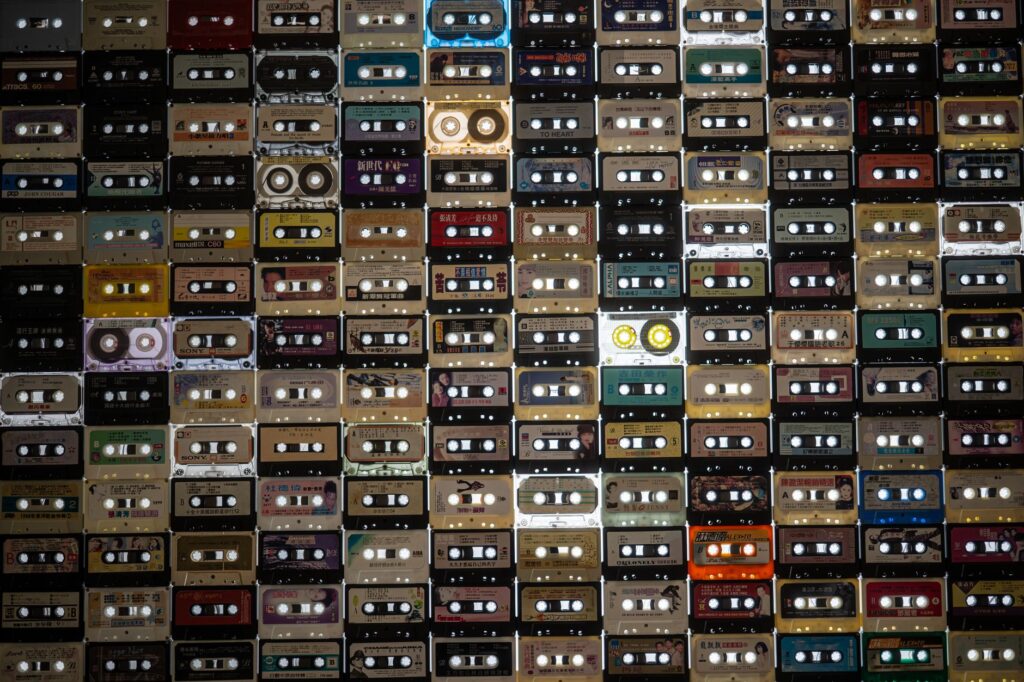
Think Nickelodeon’s visual identity circa 1993, Nirvana’s art direction, early AOL interfaces, or the aesthetic of cassette tape inserts. That’s where the 90s aesthetic AI generation really comes alive.
Choosing the Right AI Tool for the Job
Not every AI image generator handles retro styles equally well. The tool you choose significantly affects how much heavy lifting your prompts need to do.
Midjourney is arguably the strongest option for retro AI art right now. Its training data includes a vast range of illustration styles, and it responds well to specific art direction language. The aesthetic rendering on Midjourney V6 and later handles analog textures, grain, and vintage color grading with impressive accuracy. If you’re serious about 80s and 90s style work, start here.
Stable Diffusion (particularly with fine-tuned models) gives you the most control. Models like Analog Diffusion, RetroWave, and DreamShaper have been trained on or fine-tuned toward vintage aesthetics. The LoRA ecosystem is especially valuable here: you can load a specific “VHS effect” LoRA or an “80s illustration” LoRA on top of a base model and get results that would require extremely detailed prompting in other tools.
Adobe Firefly and DALL-E 3 can produce retro-adjacent imagery, but they tend to soften and sanitize the results. You’ll get “vintage-inspired” output rather than genuinely era-specific artwork. They’re fine for casual use, but for authentic vintage style AI work, they’re not the first choice.
Building Prompts That Actually Work for Retro Styles
Prompt construction is where most people go wrong. Typing “80s retro neon” produces generic, uninspired output. You need to think in layers: subject, style reference, medium, technical qualities, and color language.
The Prompt Layer System
Here’s a framework that consistently produces strong retro aesthetic AI creation results:
Layer 1: Subject. Be specific. “A woman” is weak. “A woman in a power suit with large shoulder pads and crimped hair” carries decade-accurate detail that steers the model immediately.
Layer 2: Style Reference. Name actual artists, movements, or media. “In the style of Patrick Nagel” for 80s illustration. “Airbrush art in the style of Drew Struzan” for that movie-poster quality. For 90s work, try “in the style of a Nickelodeon bumper graphic” or “inspired by 90s underground zine illustration.” These specifics matter far more than the word “retro.”
Layer 3: Medium. Specify what it looks like it was made on or with. “Scanned airbrush illustration on heavy card stock.” “VHS recording with tape dropout artifacts.” “Early Macintosh desktop graphics.” “Photographed on expired Kodak Gold 200 film.” Medium descriptors add enormous authenticity.
Layer 4: Technical Qualities. This is where you add the analog imperfection. Include terms like: scan lines, chromatic aberration, CRT phosphor glow, film grain, JPEG artifacts, color bleed, lens flare, halftone printing dots, faded ink, magnetic tape distortion.
Layer 5: Color Language. Don’t just say “neon colors.” Specify: “hot pink (#FF007F), electric blue, and deep violet against a black background.” Or: “muted teal and dusty rose with sepia undertones.” Precise color language dramatically reduces the number of iterations you need.
Example Prompts That Actually Work
For an 80s synthwave cityscape in Midjourney: “Retrofuturistic neon city at night, perspective grid extending to horizon, chrome skyscrapers with pink and teal neon signs, large full moon with purple atmosphere, airbrush illustration style, hot pink and electric blue color palette, synthwave aesthetic, scan lines, chromatic aberration, highly detailed –ar 16:9 –style raw”
For a 90s grunge portrait: “Portrait of a young woman in flannel shirt, early 90s grunge aesthetic, photographed on expired film with heavy grain, muted green and burgundy tones, faded contrast, photocopied zine texture overlay, lo-fi photography style, analog imperfections, slightly underexposed –ar 4:5”
Notice that neither prompt uses the word “retro” as a crutch. They describe the era through specific visual language instead.
Post-Processing to Push the Retro Feel Further
Even excellent AI output benefits from light post-processing when you’re targeting specific retro aesthetics. You don’t need to be a Photoshop expert. A few targeted adjustments go a long way.
Adding VHS effects is one of the most requested techniques for 90s aesthetic AI imagery. Tools like Kapwing, Canva’s VHS filter, or the free desktop app “VHS Camcorder” let you layer tracking lines, color bleed, and timestamp overlays onto any image in under two minutes. For Photoshop users, the “Glitch” filter set from Filter Forge or free action packs from sites like Filtergrade handle this well.
Film grain and color grading are your best friends for 80s-era portraits and illustrations. In Lightroom or Capture One, pull highlights toward magenta, push shadows toward teal or dark green, add grain at around 25-40 ISO equivalent, and reduce clarity slightly to soften digital sharpness. This single grading approach transforms clean AI output into something that reads as genuinely analog.
Halftone overlays instantly push artwork toward printed media aesthetics, common in both decades. A simple halftone dot pattern applied at 15-25% opacity over your AI image (using the “Multiply” or “Overlay” blend mode) suggests offset printing, old magazine scans, and comic book color separation. It’s a small touch, but it changes how the eye reads the image entirely.
Building a Consistent Retro Style Across Multiple Images
If you’re creating a series, a brand identity, or a portfolio built around retro visual language, consistency becomes critical. Generating ten images that all feel “80s-ish” but have no visual coherence doesn’t make for compelling work.
In Midjourney, use the --sref (style reference) parameter to lock in visual consistency across a series. Generate one strong anchor image, then reference its job ID in subsequent generations. This maintains color palette, texture style, and compositional logic across your project.
In Stable Diffusion, save your seed numbers. A specific seed combined with a consistent prompt structure produces coherent output far more reliably than regenerating from scratch each time. Combine that with a consistent LoRA or style checkpoint, and you’ve got a replicable pipeline for retro aesthetic AI creation that any client or collaborator can understand.
It’s also worth building a “style bible” document for your retro projects. List your exact hex codes, specific prompt phrases that worked, which models or checkpoints you used, and what post-processing steps you applied. This sounds like administrative overhead, but it’s the difference between a cohesive body of work and a collection of vaguely similar images.
Where to Find Reference Material and Stay Sharp
The best retro AI art practitioners treat reference gathering as a serious discipline. The more deeply you understand the source material, the more specific and effective your prompts become.
Start with these resources: the Are.na platform has dozens of curated boards specifically for 80s and 90s visual culture. The Letterform Archive has documented thousands of period-accurate typographic and design artifacts. Old magazine scans from publications like Omni, Heavy Metal, and MacWorld are goldmines for visual reference. YouTube channels dedicated to VHS recordings, retro television commercials, and 80s/90s movie trailers give you moving-image reference that informs how static AI images should feel.
For community feedback and inspiration, the Midjourney Discord’s showcase channels and the r/StableDiffusion subreddit both have active members sharing retro-style work with prompts attached. Studying what other practitioners are doing, specifically what’s working and what looks generic, sharpens your own prompt-writing instincts faster than any tutorial.
The era-specific visual knowledge you build is ultimately what separates good retro AI art from the obvious AI-filtered tourist traps. Get the history right, get the details specific, and the tools will follow your lead. Start with one decade, master its visual vocabulary, then expand. You’ll produce sharper, more distinctive work by going deep on the 80s before you try to straddle both eras, rather than staying broad and generating images that could have come from anyone.